

One Page Website Examples: 8 Simple Layouts You Can Copy

One page website examples show that you rarely need a menu, a dozen pages or a developer to get a working site. A single scrolling page can introduce you, show what you offer, prove you are good at it, and let someone buy, book or get in touch, all without a single click to another page.
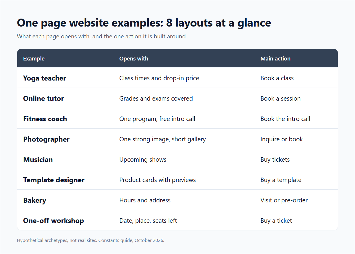
The eight examples below are hypothetical archetypes rather than real sites. For each one you get the order of sections and the reason the layout works, so you can lift the structure and swap in your own words.
Why one page websites work so well on phones
Plenty of visitors reach a small business or creator site from a phone, often by tapping a link in a social profile or a message. On a small screen, scrolling is natural and menus are a chore. A one-page site turns the whole visit into a single path from top to bottom, which means you control the order in which people see things.
The trade-off is space. Every section has to earn its spot, so one page sites push you toward short headlines, clear prices and fewer distractions. That constraint is usually a gift.
One page website examples for teachers and coaches
1. The yoga teacher. A hypothetical yoga teacher's page might open with a photo and "Small-group and private yoga in Denver," then list weekly class times, a drop-in price, private session booking, and a short note on what to bring. It works because returning students find the schedule instantly and new ones see the price before they have to ask.
2. The online tutor. A math tutor could lead with the grades and exams covered, then show two session lengths with prices and a booking calendar, followed by three short parent testimonials. It works because parents are deciding on fit and logistics, and both are answered in the first two screens. The guide for teachers and tutors covers what else such a page can sell.
3. The fitness coach. An online coach might show one main program, a free intro call, and a short "how it works" section in three steps. It works because the steps reduce the fear of the unknown that stops people from signing up.
One page website examples for creatives
4. The wedding photographer. A photographer's page could open with one strong image, then a short gallery, package starting prices, a "what's included" paragraph, and an inquiry or booking step. It works because couples compare style and budget first, and the page answers both before they ever contact anyone.
5. The musician. An independent musician might list upcoming shows with ticket links, embed or link the latest release, and offer a paid fan membership near the bottom. It works because fans arrive for different reasons, and a single page can serve all of them in order of urgency: shows first, music second, deeper support third.
6. The template designer. A designer selling planners and templates can treat the whole page as a storefront: a short intro line, then product cards with previews and prices. It works because there is nothing to explain that the products don't show on their own.
One page website examples for small businesses and events
7. The neighborhood bakery. A hypothetical bakery's page might show hours and address at the very top, then this week's specials, a pre-order note, and a map link. It works because most visitors want to know one thing (are you open?) and the answer is the first thing they see.
8. The one-off workshop. Someone running a single weekend workshop could build a page with the date, location, agenda, instructor bio, ticket price and remaining seats. It works because a temporary event doesn't need a permanent website, just a clear page that does its job and can be retired afterward.
The layout that most one page website examples share
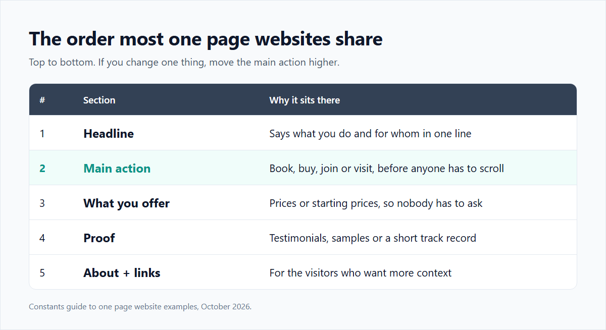
Strip away the details and nearly every example above follows the same order:
- A headline that says what you do and for whom
- The main action, such as book, buy, join or visit
- What you offer, with prices or starting prices
- Proof: testimonials, samples or a short track record
- A brief about section, then secondary links at the bottom
If you only change one thing about your current site, move the main action higher. A page that makes people scroll past a long bio to find the button is asking them to work harder than they will.
Building a one page website on Constants
Constants publishes this article. A Constants page at constants.com/yourname is a one-page site with your links plus a built-in shop, so examples 1 through 6 and 8 can take payment directly: digital products, calendar-based 1:1 bookings, event tickets and recurring memberships, with a community space, analytics, a notes workspace and AI agents that help you plan. The Starter plan is free and can sell from day one; Premium is $29.99 a month. There is a 6% platform fee on one-time sales and 10% on memberships on every plan, plus Stripe's card processing. The numbers are laid out on the pricing page.
It is not the right fit for everyone. The bakery in example 7 mostly needs hours, a map and its own domain name, and a general one-page builder may suit it better since Constants doesn't offer custom domains. If you want to compare the two approaches, the Carrd comparison lays out where each one is stronger.